Bedroom Paint Color Indecision (and Do We Like Stripes?)
")
Bedroom Paint Color Indecision
Hello friends. In the four years we’ve lived in this home, our bedroom has gone through quite a few changes. Nothing really planned out, just the kind of updates that happen over time as you live in a home.
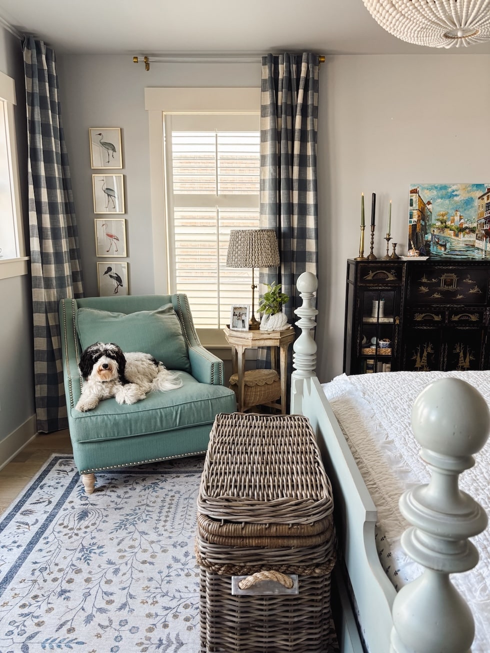
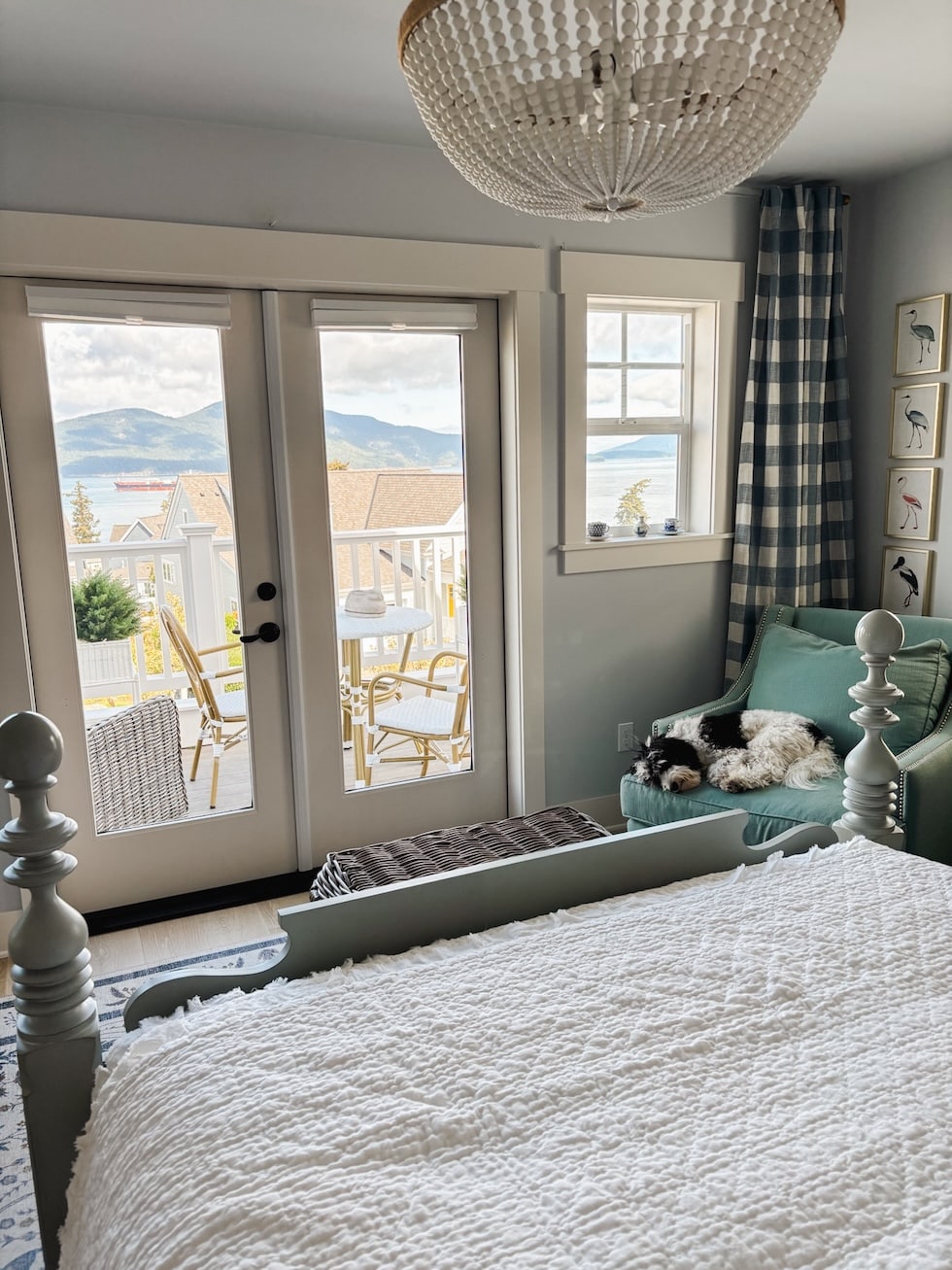
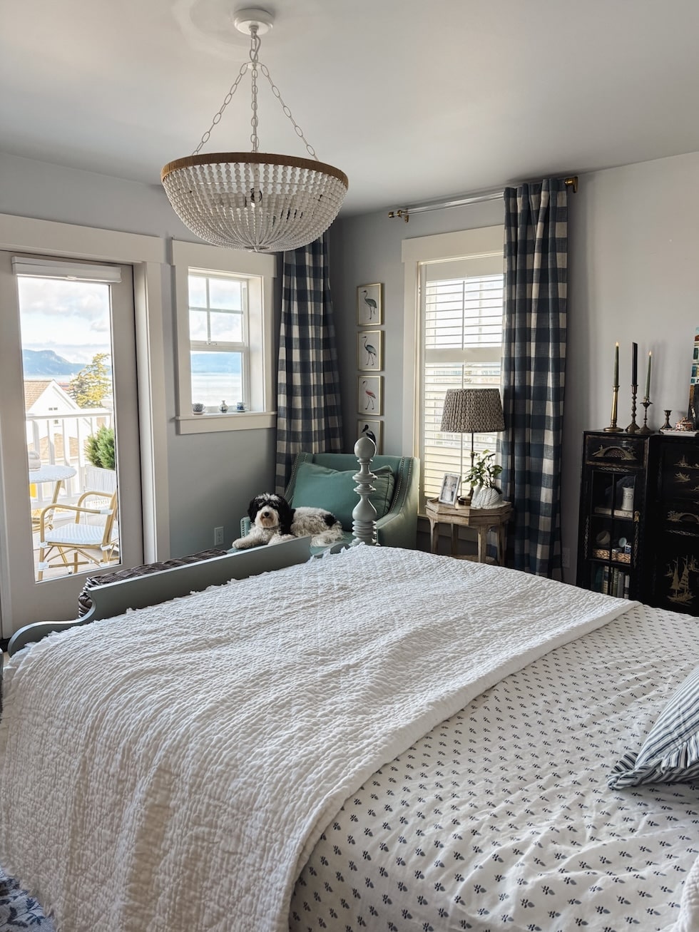
We’ve rearranged some of the furniture, added curtains, swapped out bedding and rugs, changed the light fixture, found our dream bed on Facebook Marketplace (still so happy about that one!), and even put in new floors when we were installing the rest of the floors downstairs—they honestly made the biggest difference. Bit by bit, the room keeps evolving.
Lately, though, we’ve been talking about (finally!) painting the walls. We haven’t touched them since we moved in! We actually still like the color we have (it was here when we moved in, called Bunny Gray by Benjamin Moore) — but it definitely needs a paint refresh.
So now we’re in the “what color should we paint it?” stage, which is somehow fun and the most impossible part. Ha! Why is paint so hard?
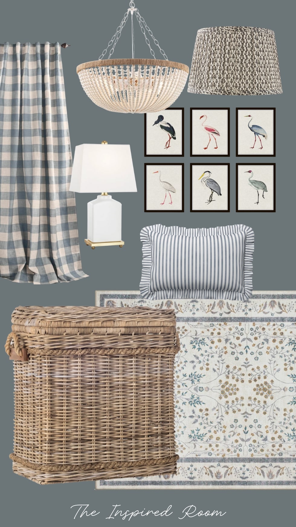
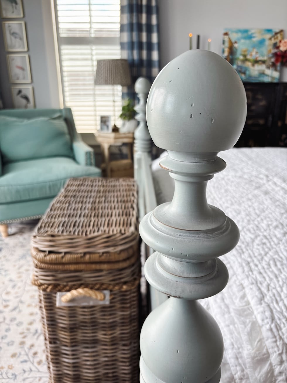
Since the bed (in a pretty shade of robin’s egg blue/green) is staying, that’s our starting point. We want to find a wall color that complements it — something that looks good with our floors and natural lighting (northwest facing and a bit of morning sun), but also doesn’t compete with the bed color.
If I were up for a bigger project, I’d be tempted to go with a wallpaper or creamy white tongue-and-groove paneling. Both would look so lovely with our bed! But paint feels like the simplest next step…practical, needed, and something we can tackle without turning it into an unnecessarily big project or expense.
We always seem to circle back to blue in this room. Every time we think about going in a different direction (like a soft neutral or even a muted green) it just doesn’t feel right. There’s something about blue that makes this space feel peaceful and happy.
And that’s really what I care about most when decorating. Not just how a room looks, but how it feels to be in it.
I did consider green, but since our bed already leans a little green, blue feels like a softer, prettier contrast.
Yellows, soft neutrals, browns, rusts, salmons, or pinks could look very pretty, too but somehow they haven’t felt right to us. Maybe I just haven’t landed on the right one.
That said, creamy white paneling would be my dream look. Maybe one day! For now, we’re still testing blues. I can test other options if none of these feel right.
We want something cozy but not dreary…just enough depth to make the bed stand out, but not so dark that the room feels heavy.
The tricky part is that a lot of blues we like are too close in tone to the bed. I don’t mind a tonal look, but I also don’t want the bed to disappear. I sampled Wales Gray, Eventide, and one called Morning at Sea (love the name!) that was a deeper blue that caught my eye, too — it might be a bit brighter than I want, but it could be stunning. I’ve seen it in other homes and it didn’t really seem bright at all. Sometimes you just need to see the color on your own four walls before you can really tell.
We’ve also thought about going lighter than the bed similar to the mood we have now, but so far, nothing has felt quite right.
I think this room wants to feel like a happy beach cottage, but it is a small room so it could feel cozier with a slightly moodier “NW beach cottage” tone.
I also considered “Beach Glass,” which we already have in our living room. It’s such a soothing shade! I’m just not sure if it would feel different enough from the bed, but it might be worth testing a swatch or two.
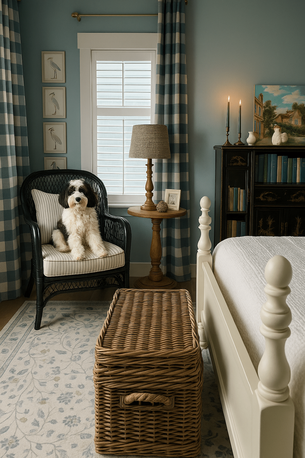
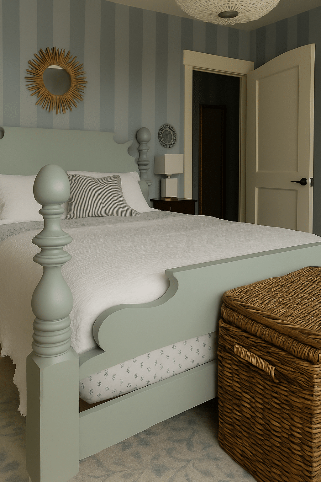
And here’s a fun experiment — we actually asked ChatGPT to show us what the room might look like if it was a slightly moodier shade of blue! It didn’t get my bed color quite right (and it made a whole new Finnegan ha), but still fun to see and really helps to visualize options.
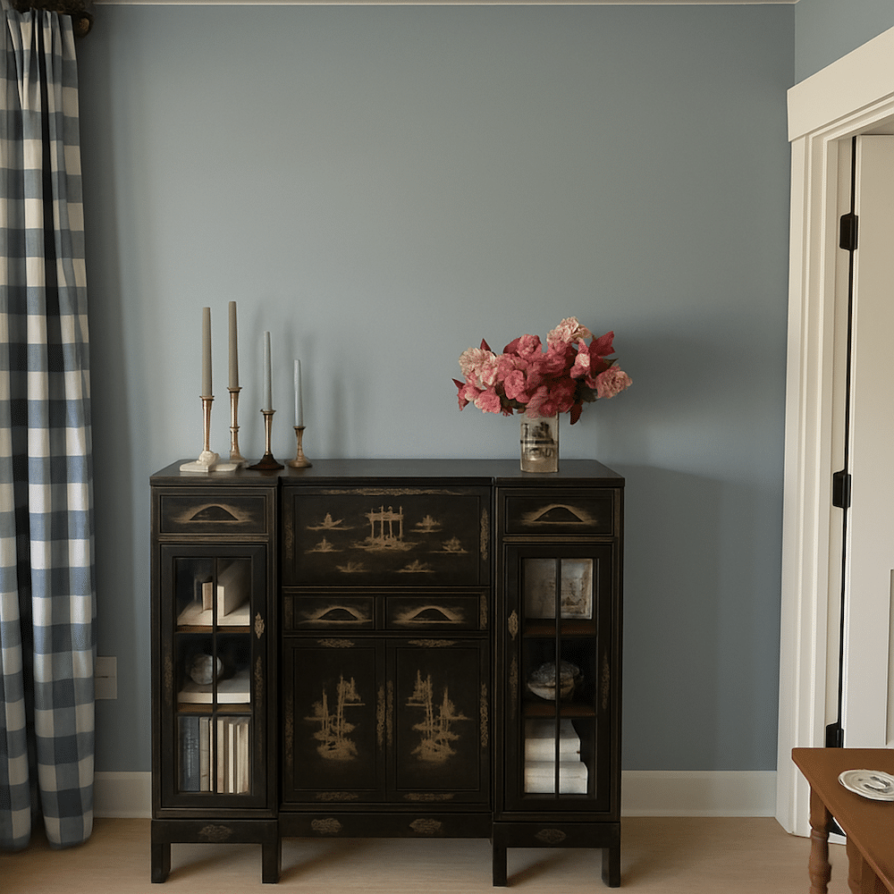
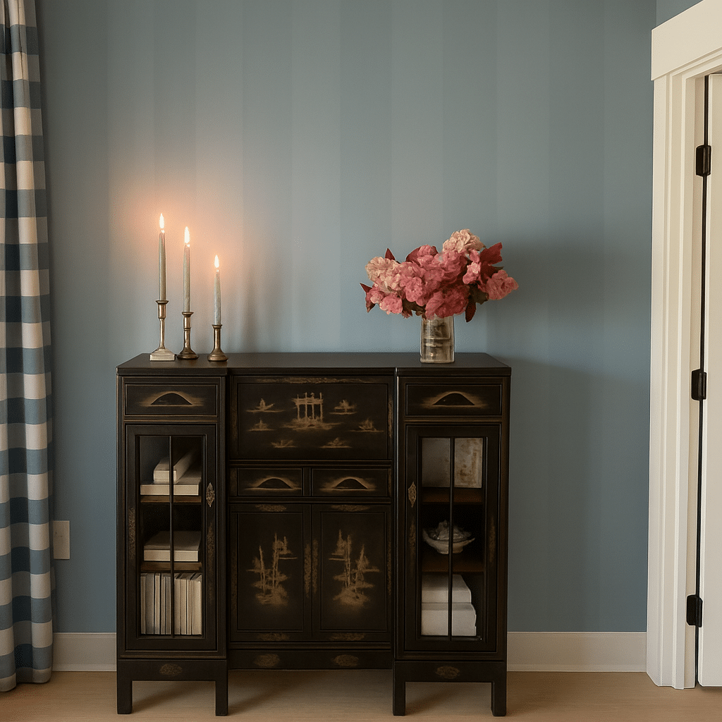
Oh! And I also asked what it would look like if we swapped out our current chair for a black rattan one. I love how it ties in with the black Chinoiserie cabinet we already have —and makes our heirloom cabinet feel more intentional.
I really like it like this mood, so if I could get the color right this is a possibility.
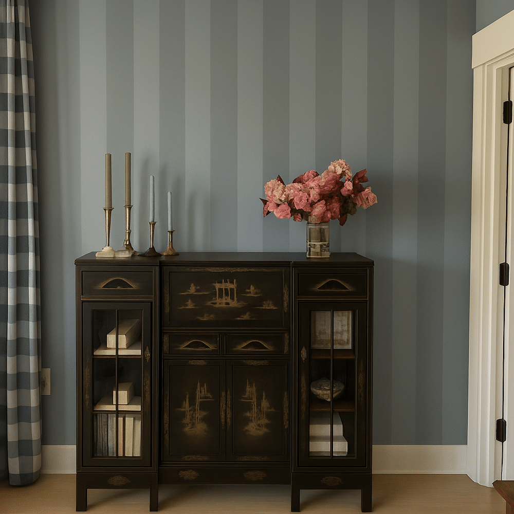
But then for a fun twist we asked if it could make striped walls in shades of blue.
Check it out!
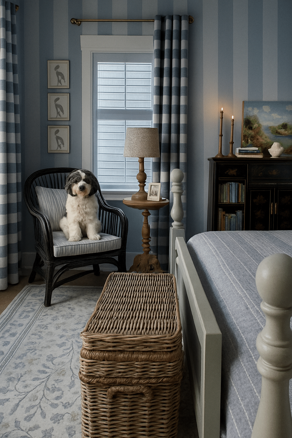
Striking, yes? The other elements in the room or the shades of blues could change, and the width and contrast of the stripes could also be adjusted if we wanted something softer.
Really nothing that is in the room has to stay, except the bed! But it’s preferred to be able to work with at least some of what we have.
Surprisingly, my husband loved the idea of stripes! I know stripes aren’t everyone’s idea of a relaxing bedroom, but we don’t mind a little pattern.
Stripes could make the room feel cozy, layered, and a bit more visually interesting…especially behind the bed.
Sometimes patterns seem to have the opposite impact than you think, rather than “energizing” the mood, they somehow can calm the room and make everything in it feel more snug. But of course, it’s definitely personal preference!
On a positive note, we’ve painted stripes before (we, meaning my husband!) so he said this would be a totally doable project.
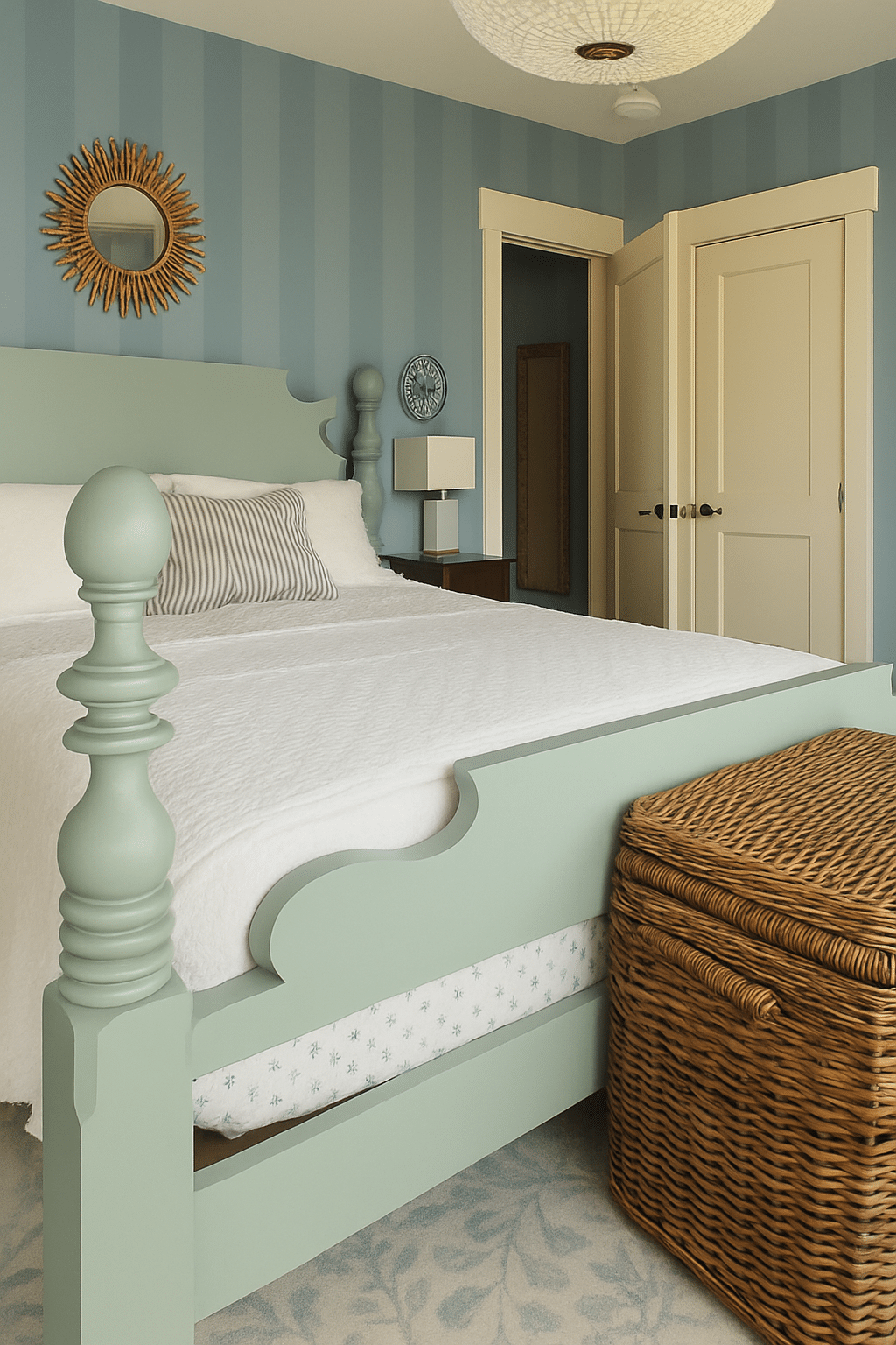
Here are a few variations and walls with blue stripes just for fun, including one with the bed in view.
Below is a slightly softer stripe contrast.
It’s fun that you can vary the colors a bit too, just to see how the mood could change! I also can’t wait to make our hallway more charming since you can see it from our room, so it’ll be fun to work on each space in time.
Now, back to reality, we have to make a decision.
I have saved tons of inspiration photos for rooms I’d like in all different colors and styles–but sadly we can’t use all of the ideas all so I have to narrow it down :).
I’d love to hear your thoughts! What color or pattern would you choose? Would you stick with the color we have? Try something totally different? Get bold with a pattern?
I asked this question on my Instagram stories awhile back and got lots of good ideas.
Obviously I won’t make everyone happy–not everyone will like what I choose and that’s OK. Not everyone will share my taste or can even know what will actually look or feel best in the room without being in it.
But it is fun to hear everyone’s thoughts and perhaps there are colors or ideas we haven’t considered yet.
By the way, if you ever want to see what your space might look like with a few fun changes, we offer AI room makeovers in our HomeBody community. They’re so fun! If you want me to make one for you, come join us — I’d love to see you there.